

SuperFood, UX Case Study
SuperFood is based of an online grocery shopping platform, offering consumers with a dietary needs a reliable alternative to the actual supermarket’s experience online.
Problem Statement
"A person with special dietary needs who feels frustrated every time he/she wants to buy his/her products online"
Every day there are many people with dietary needs who try to buy online and finally decide to go to the store because it is easier to purchase those products at the store.
The challenge
The goals was to:
Improve the experience of buying online and helping people with special dietary needs to easily recognise which products are suitable for them when they buy online, thus facilitating the purchase, that allows the customer to buy effortlessly and the supermarket to increase their sales.
My Role
I was the sole designer on this project.

Design Toolkit

User Interviews
User interviews are significant because that would bring enough data and inputs to generate concepts and hypothesis.
RESEARCH OBJECTIVES
To better understand the current online grocery market industry and competition, to identify consumers needs, and to explore what features or services an online grocery business could provide that would improve consumer lifestyles.
RESEARCH QUESTIONS
Where customers buy groceries?
What are users’ biggest shopping frustrations, and what makes a positive experience?
What online shopping features are valued and should be prioritised?
What type of products customers buy?
How easy is it for you to recognise non-animal or dietary products?
METHODOLOGY
Online surveys
In-person user interviews
Survey Results
I sent out a quantitative research survey’s including a variety of ages and dietary needs and had 26 respondents…
User of Online Platform would like to see:
Competitive price
60% of the interviewed are interested in buy more products online, but the price is crucial, and they don't know which products are the best option for them, because the labelling is not clear enough.
Special Section
75 % of the interviewed consider that it is essential to have a special section to recognise better the product.
Tag them
25% of the interviewed want to see better labelling on the products so that they can easily recognise it
Interview Insights
After analysing the interviews, despite the amount of generated data, the following was the most relevant information for decision-making in creating the solution:
As a user purchasing of non-animal/dietary products, I need clear labelling, so that I feel my needs are understood.
As a user purchasing non-animal/dietary products, I need a special zone/section, so that I feel my needs are acknowledged.
As an existing healthy customer, I need extra information so that I feel comfortable in buying a non-animal/dietary products, and avoid going to other supermarkets.
Affinity Mapping

I had taken all the data from interviews conducted by the clients and built an affinity Map.
I took this data and transferred everything on a Miro digital board to be able to keep the process and share it.
Persona
Through careful analysis of our research, I identified sufficient behavioural variables to segment our user audience. These variables we categorised into Key Decision Marker, Visual Recognition, Pricing, Special Zone, Variety.
I used the data to build my persona ‘Lisa Hutchi’ and carried her through the project as needed.

MVP (minimal viable product)
I planned to scope the remainder of the project around the experience of Lisa using an accompaniment platform that would let her select and order easily and quickly through an online experience.
I sketched out user flows based on how each insight might transfer on the web that would best place Lisa to achieve her needs and wireframes to flesh out this idea.
And then wireframed the main landing screens…
Sketches
I made sketches, then I voted on the ideas I liked the most and then I chose which ones to prototype.

User Flow
When I finish sketched my concepts, I did a user flow, to be clear about all the steps before moving on to the prototype.

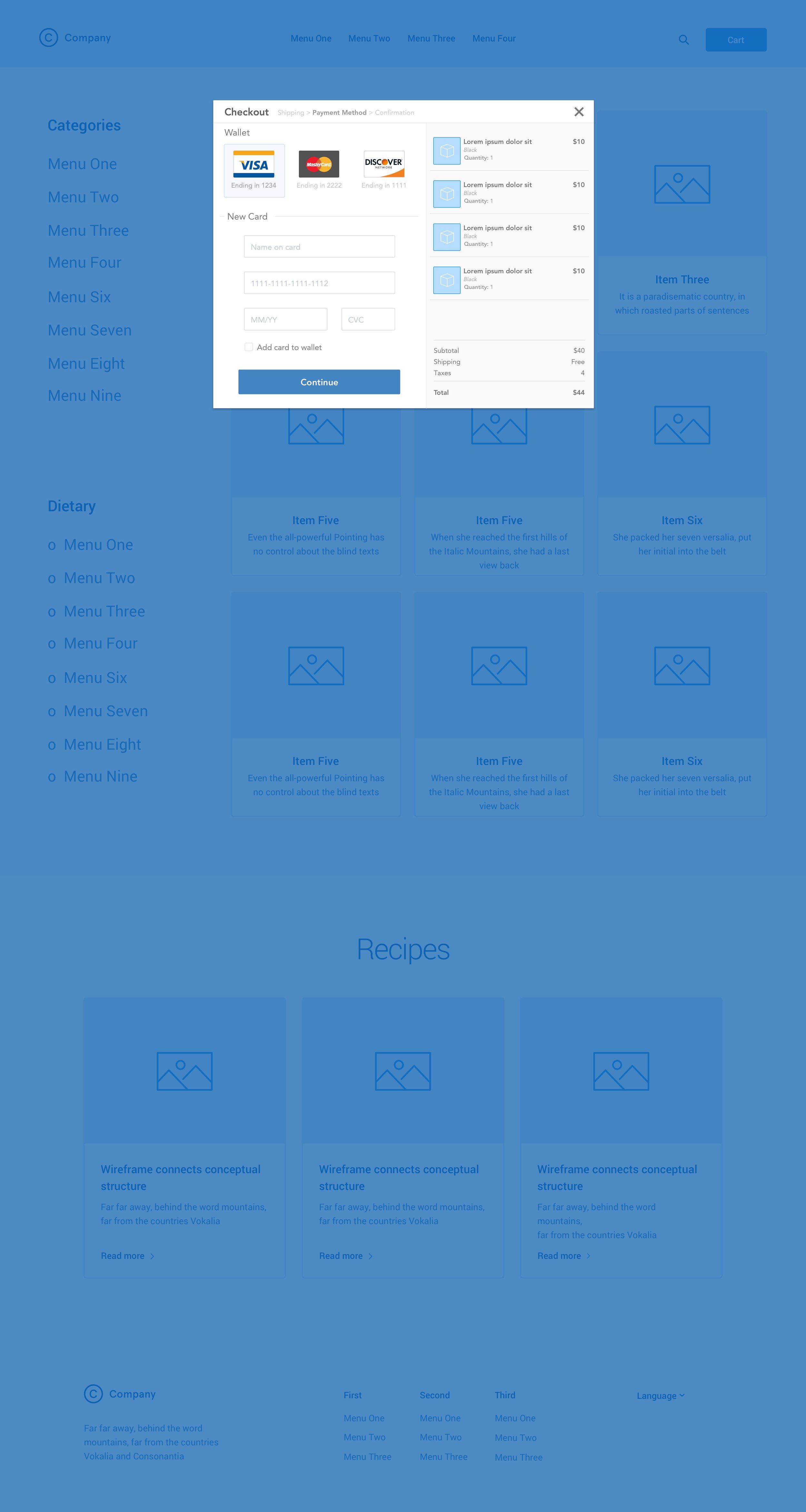
Wireframes
Wireframes were made into SketchApp to create an interactive web flow from landing page through check out page. I wrote and executed a usability testing plan, to determine the objectives of testing, process, and testing script.


Usability Test
The iterated wireframes and prototype were tested with users in-person and through online.
Based on quantitative and qualitative data from in-person and remote usability testing, the following design iterations were implemented and re-tested:
Design iterations (and re-testing)
Implement the clearest labelling to identify the categories
Original Product information be the change for another clear option
Change a notification number on product image when the product has been added to cart
Prototyping
Iterated wireframes were exported into prototyping applications to build digital prototypes that can be tested on users. I used SketchApp and Invision for prototyping.
Link to the prototype: <Try the prototype here>
Home Page

Vegan Section

Future opportunities
• Customer reviews on product page
• List of recent products bought before
• Ability to compare multiple items (by price, reviews, etc.)
SuperFood is a concept of an online grocery shopping platform, and I did it as an exercise
on my course at Academy Xi on 2019.“A big thanks to the people who participated in the interviews and gave me feedback to improve the idea.”